Message System
Purpose
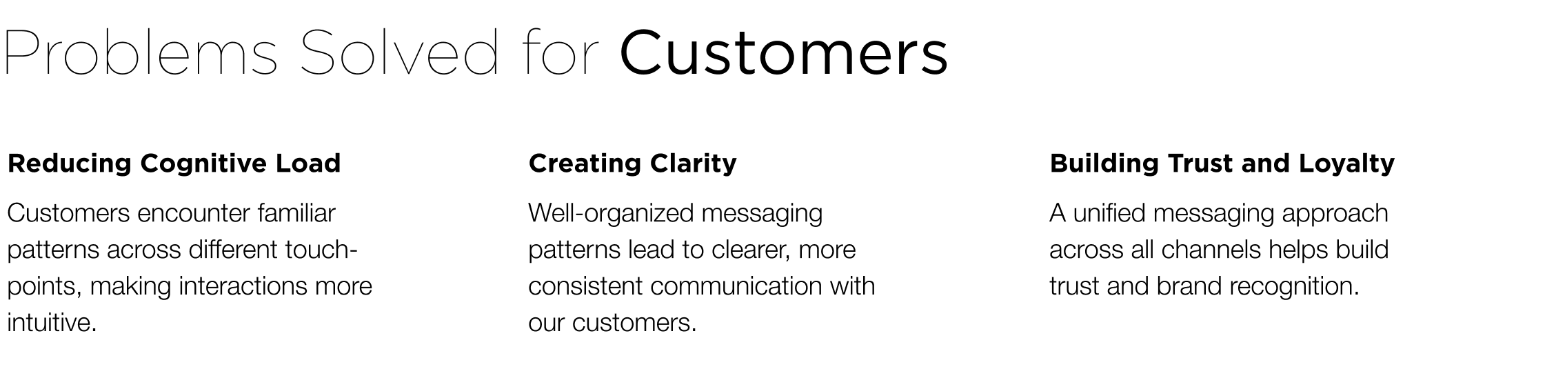
The Message Eco-system project aimed to redefine how users interact with in-app messaging by improving clarity, efficiency, and contextual relevance across user journeys. Our focus was to make critical information more accessible, reduce cognitive load, and enhance overall user satisfaction through intuitive design and data visualization.Roll & Challenges
I led this project as the UX/Product Designer, responsible for strategic vision, design research, and hands-on implementation. My work included defining user needs, creating interaction models, designing visual systems, prototyping key experiences, and collaborating closely with cross-functional partners to ensure alignment with business goals and technical feasibility.Aware of the problem
Identifying the user pain points that a design solution seeks to address.Background
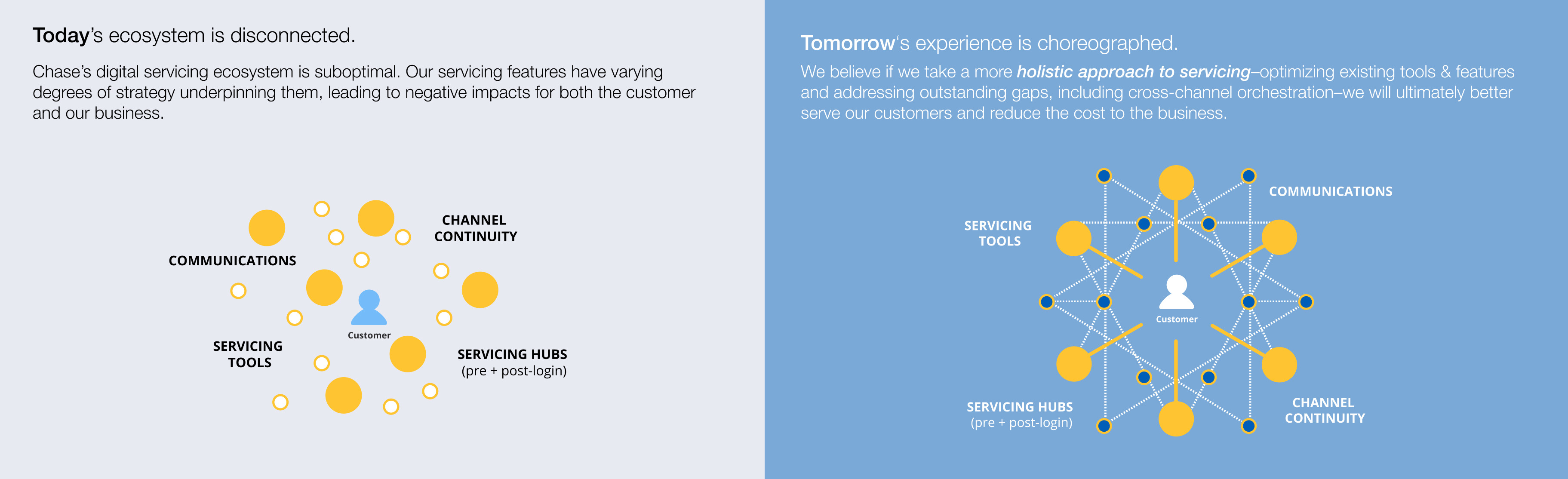
Let me introduce the background that led to the project. Chase has 63M Digitally active users. And we need to make the Digital Platforms easy and safe for our customers. However, we faced three servicing experience gaps contribute to poor CX and We focused on Relevancy 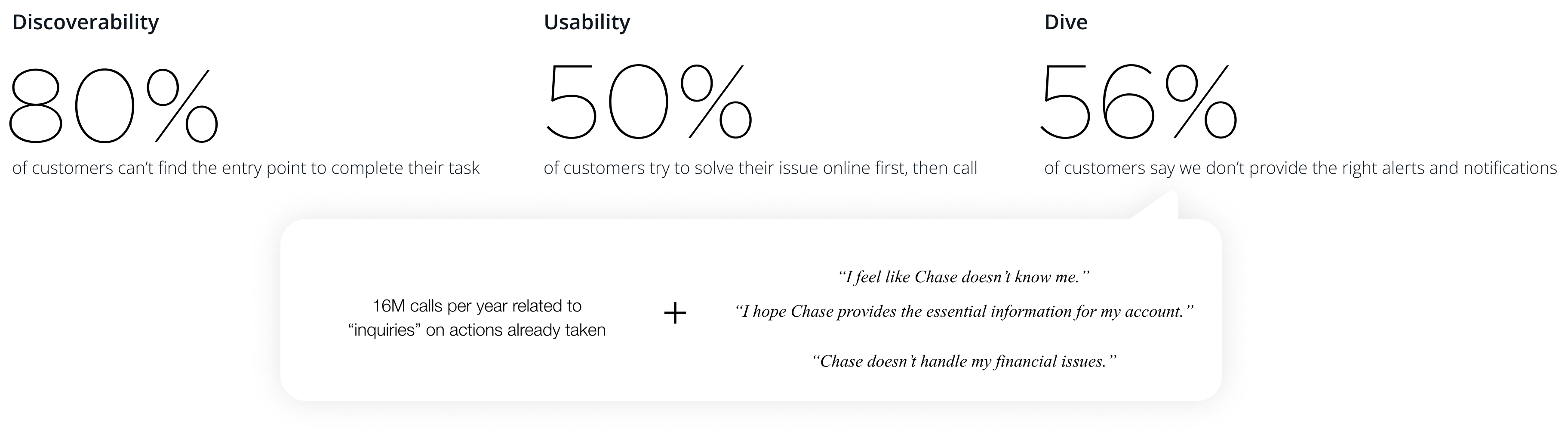
Alignment and collaboration
Identify the needs of the Line of Business (LoB) and align with stakeholders on the definitions of Messaging Patterns.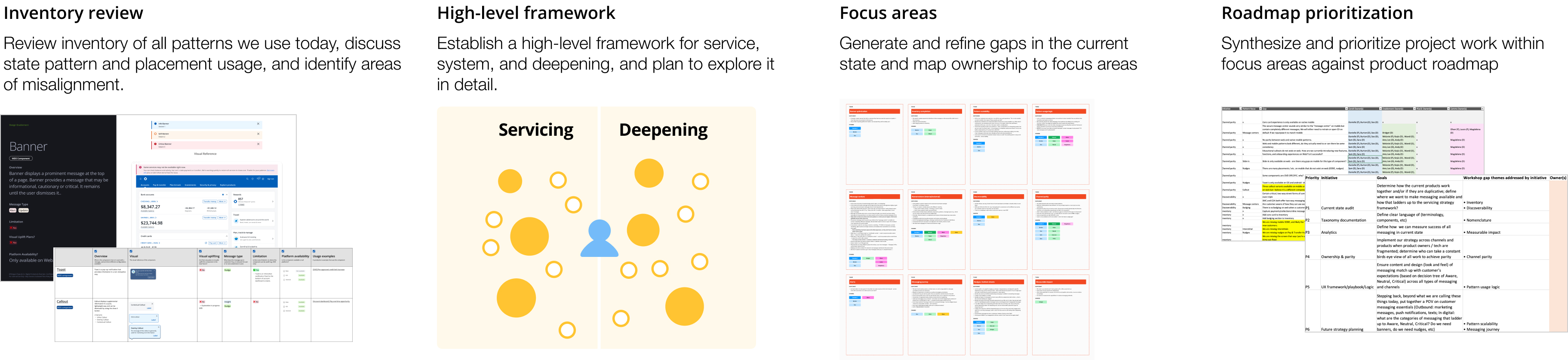
Define the problems
-
Lack of proactive communication regarding account activities leads to customer dissatisfaction and increased operational costs.
-
Servicing and promotional messages are delivered in the same format, causing users to ignore them due to “banner blindness.”
Approach to the Solutions
- We need to optimize user flow and message placement to ensure essential service communications reach customers at the right time and in the right context.
- Improving message structure and delivery patterns is essential for achieving effective and meaningful customer communication.
Establishing a clear structure
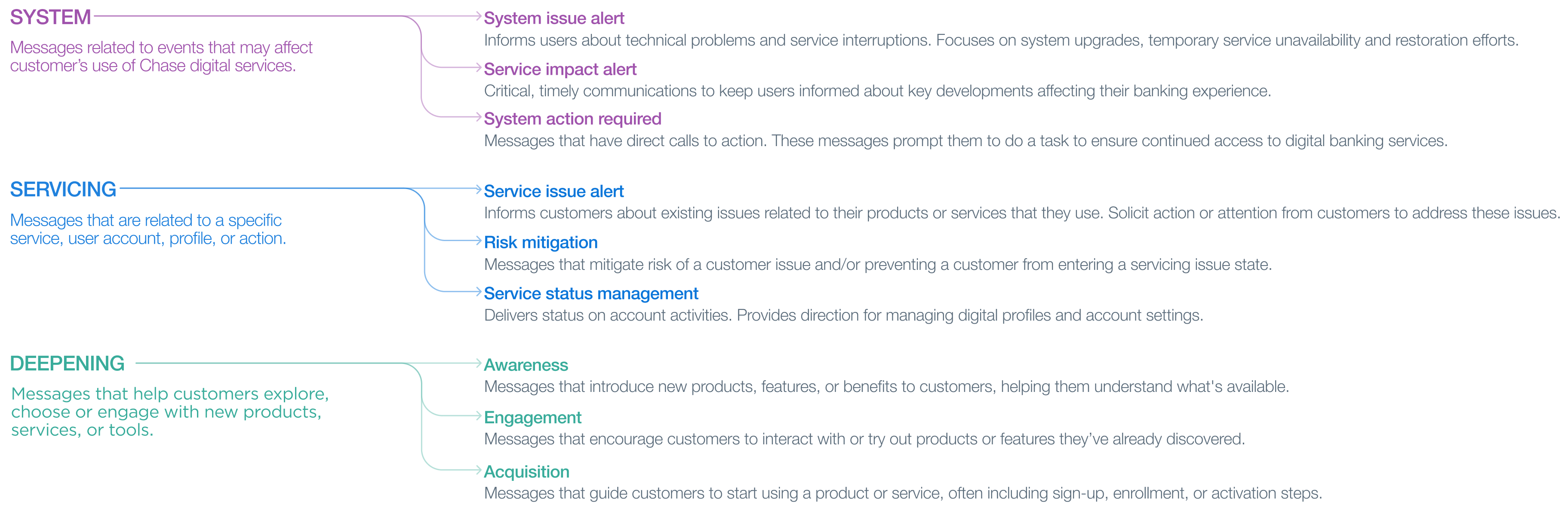
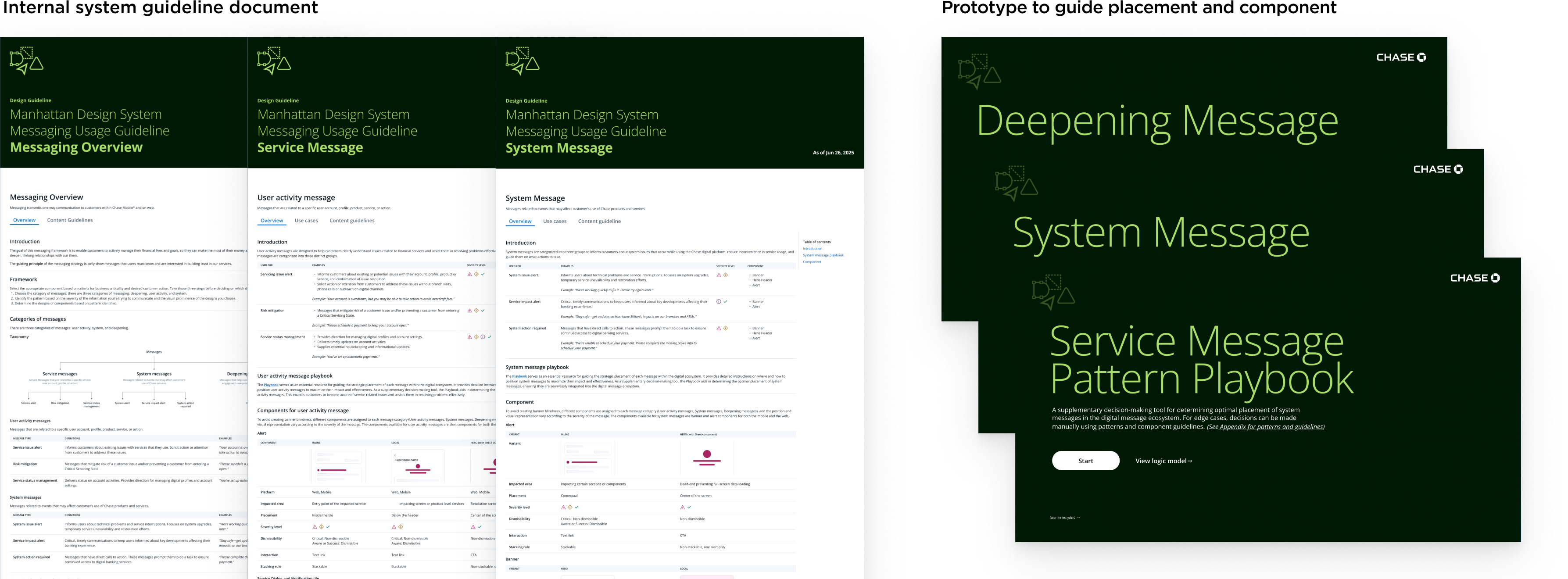
We needed a well-defined message taxonomy to serve as the foundation of our messaging framework.A structured taxonomy is essential for clearly categorizing messages based on the type of information being communicated to customers.
To achieve this, we conducted a comprehensive audit of all message inventory and carefully reviewed existing use cases. This allowed us to define the framework and identify meaningful sub-categories that align with both customer needs and business goals.
It helps set the right customer expectations and prevents issues such as banner blindness.
Inventory realignment proposal
Create a realignment proposal to map out the appropriate pattern for each messaging component in our inventory.Baseline and Direction
- Use distinct components for Service, System, and Deepening to avoid banner blindness.
- Only interrupt the user when necessary and valuable.
- Take control and minimize deepening patterns.
- Combine components with similar functionality and visuals.
- Remove legacy components no longer in use.
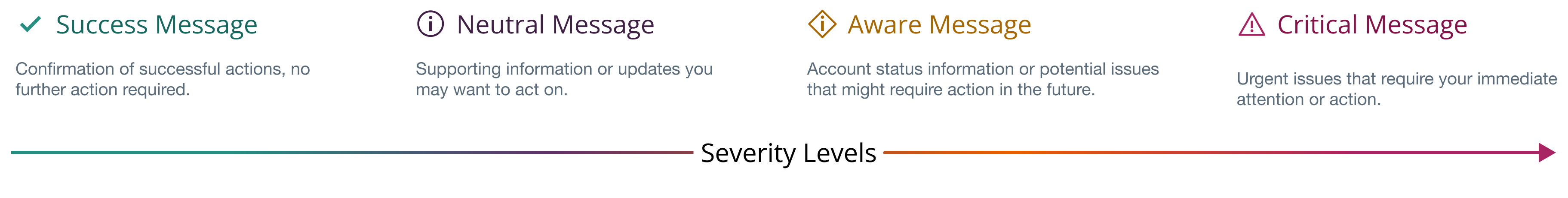
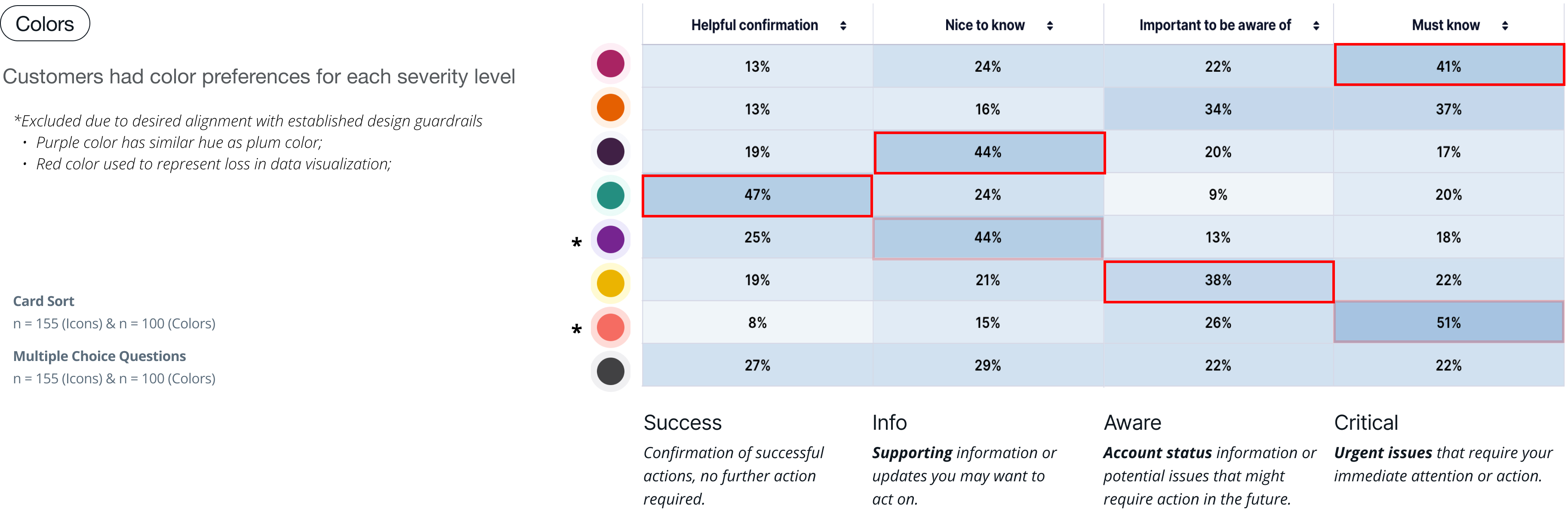
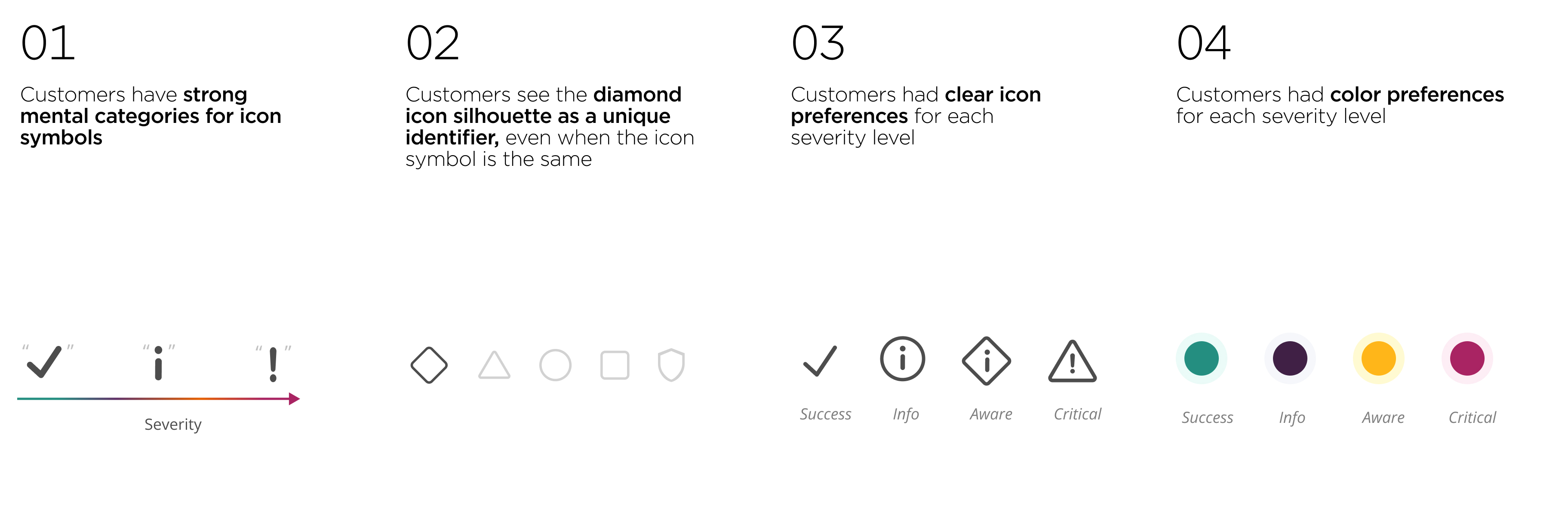
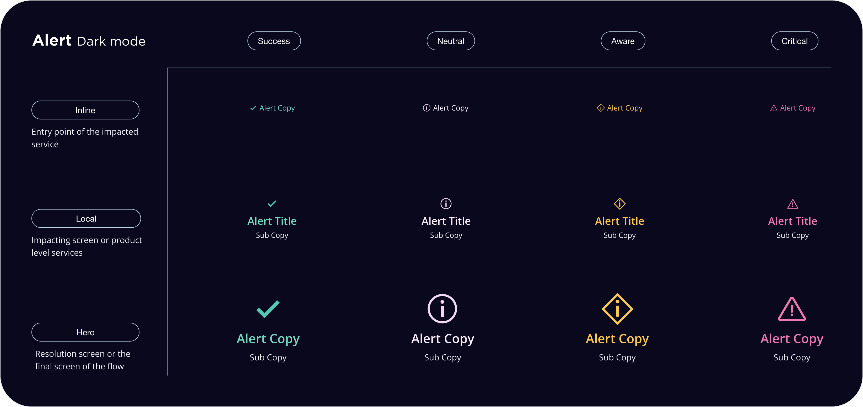
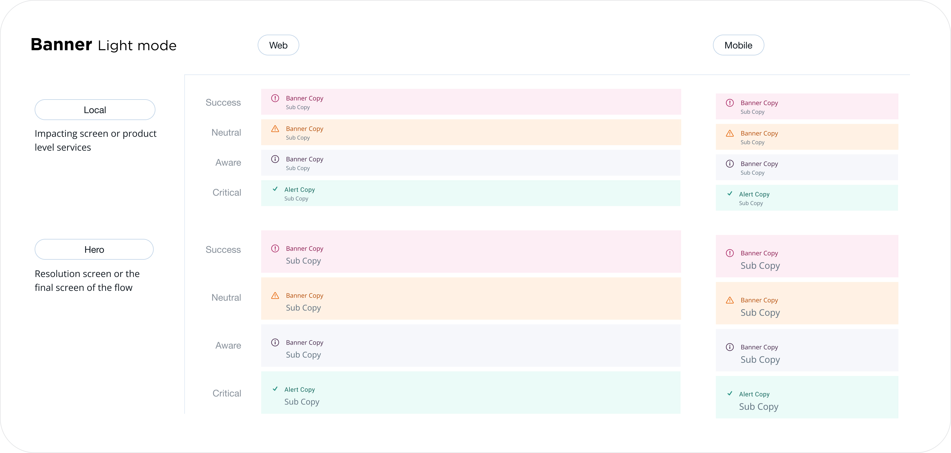
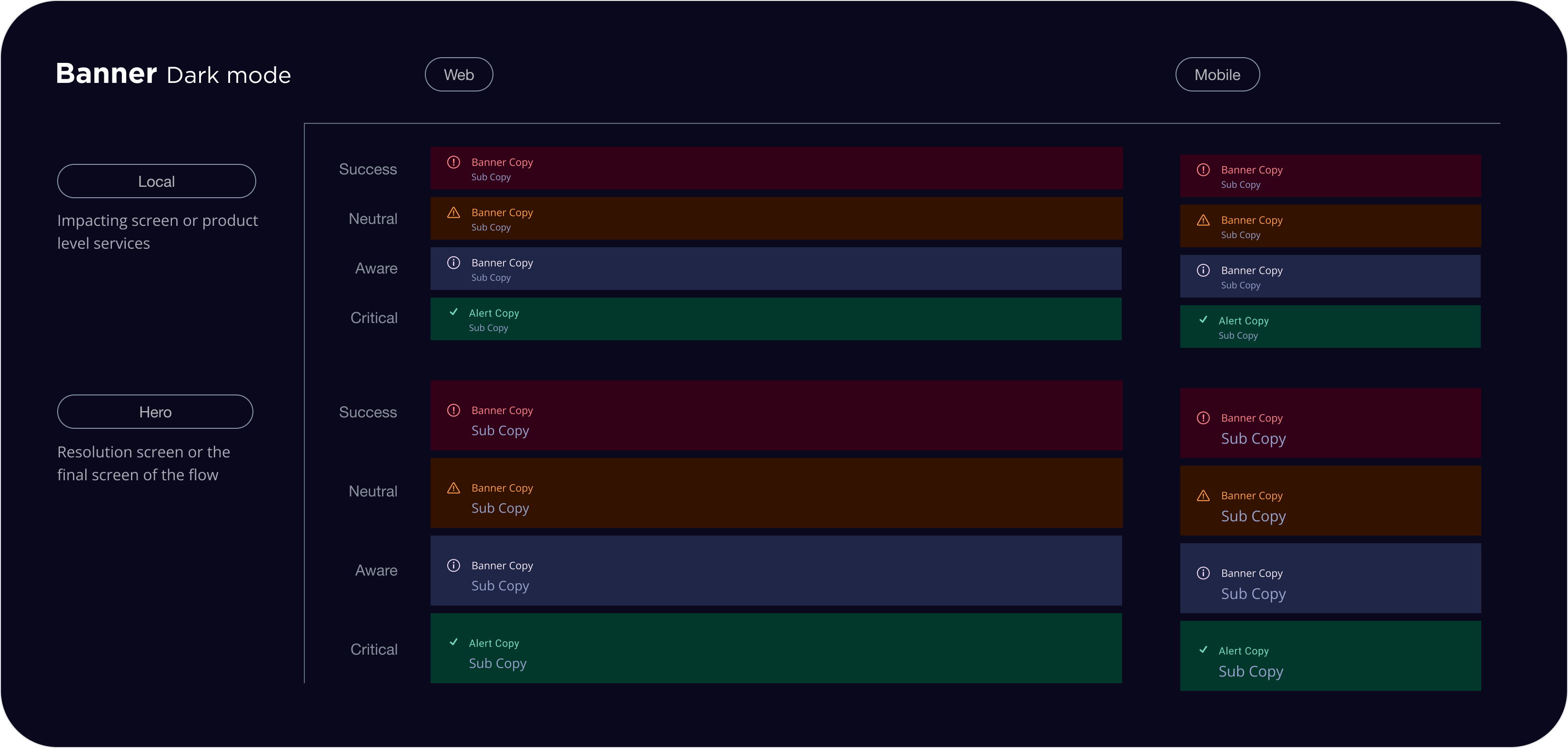
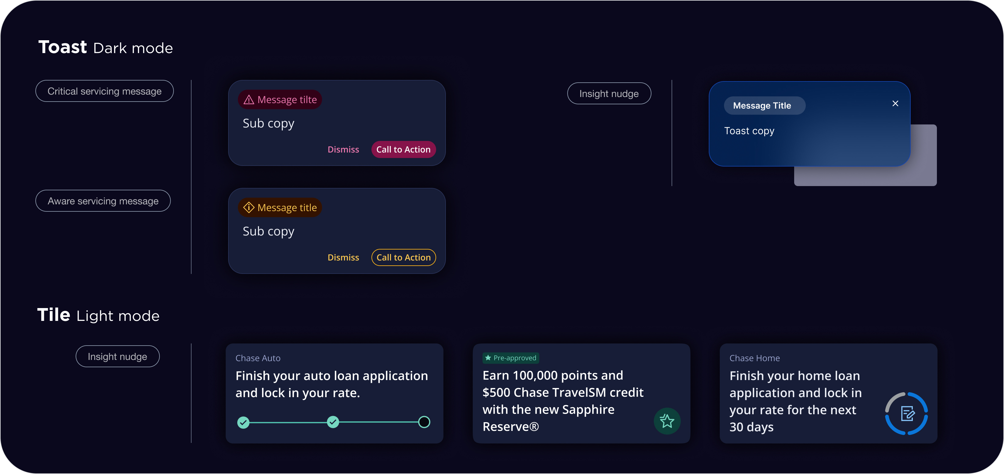
Severity levels and visual indicators
Visual indicators are essential for conveying the urgency or priority of alerts or messages within a user interface. These indicators typically consist of predefined colors and icons designed to capture user attention and emphasize the location of the alert or message within the experience.Each severity level (critical, aware, neutral, and success) is represented by a specific prominence on the interface surface. The icons and colors associated with each severity level are standardized and must not be modified. It is imperative to adhere to the designated colors as specified in the guidelines.
Research Analysis & Insights
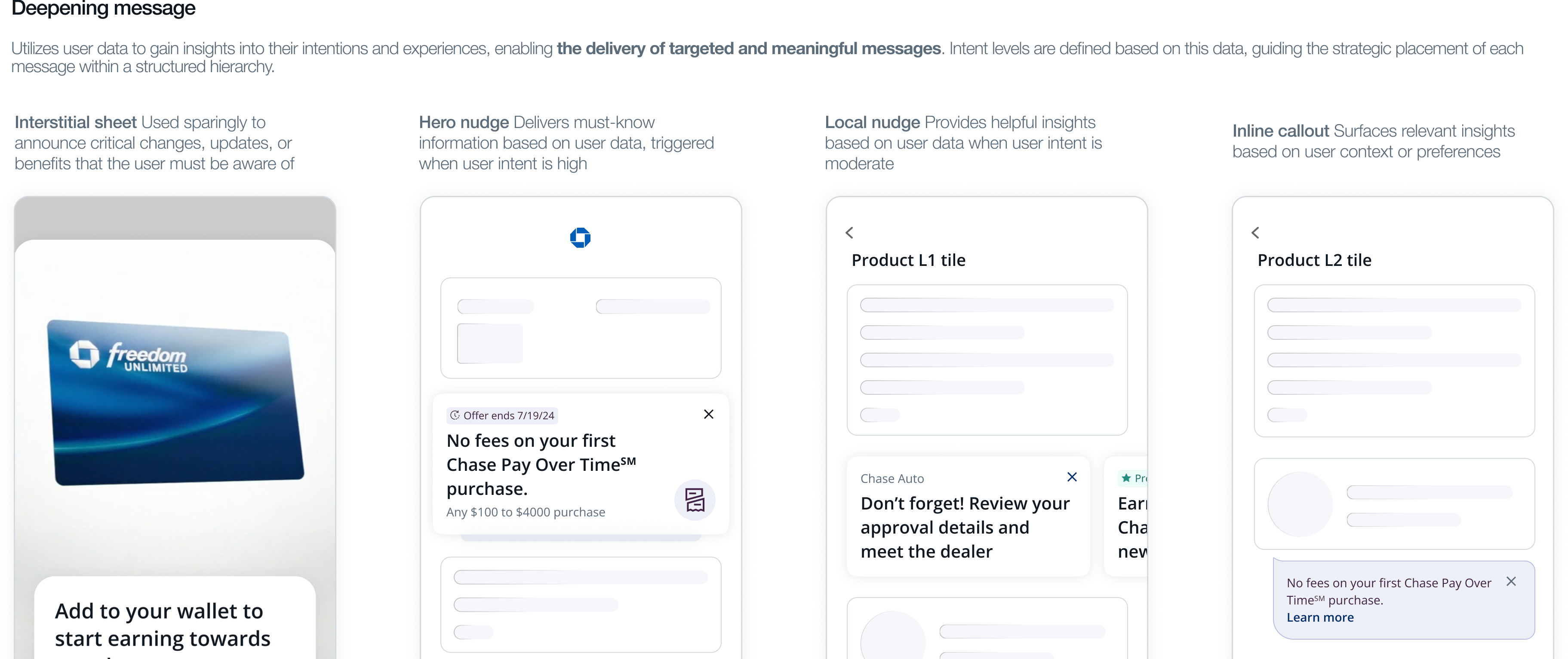
We developed a framework that is designed to help capture all types of messaging opportunities that can live System, Servicing, and Deepening patterns based on the users’ need and desired interaction we would like them to take.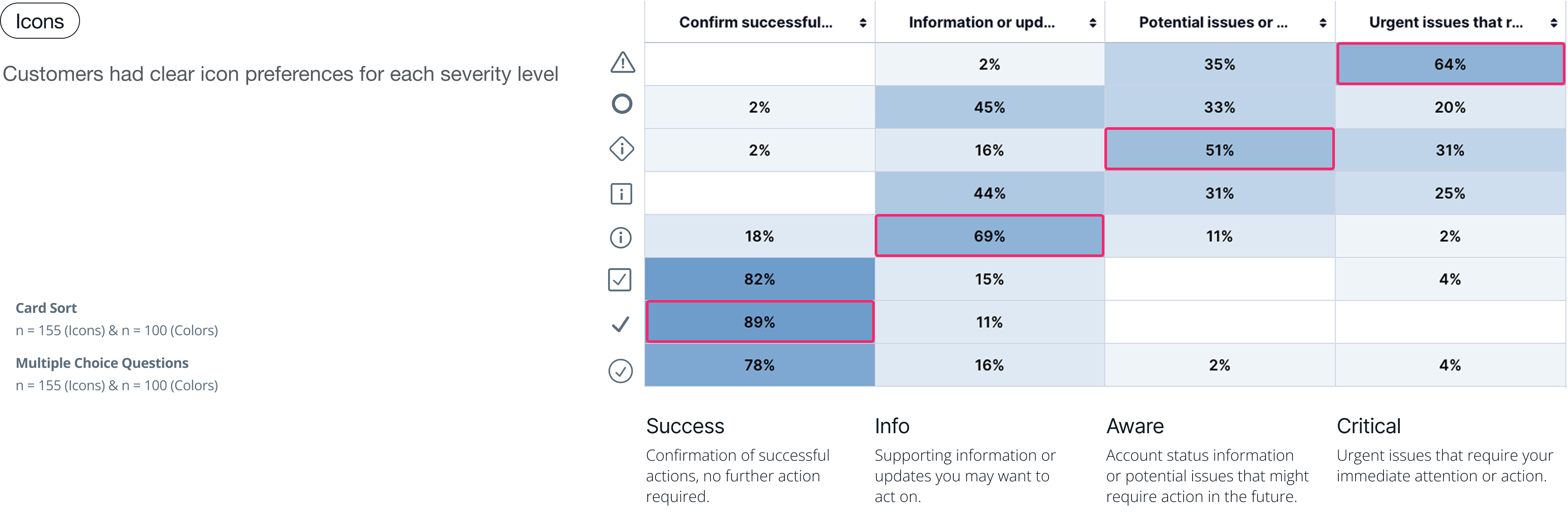
Level of disruption
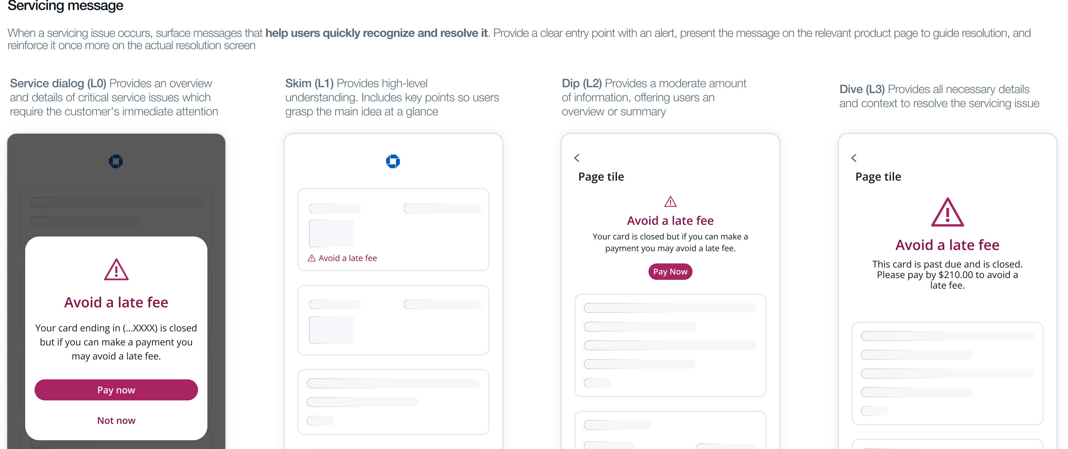
Disruption is defined by where and how long a message appears. Some components are more intrusive, while others are passive, allowing users to view messages when needed. Visual cues like color, icons, and urgent content tone can also increase disruption. For example, a high disruption level is a dialog notifying users of a critical update is necessary to continue using the platform. The dialog interrupts the user experience, blocking further progress until the user takes action.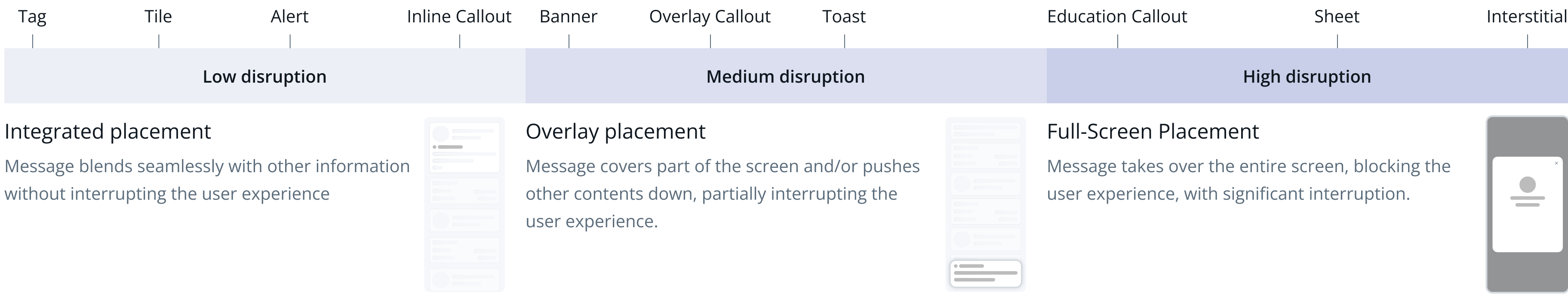
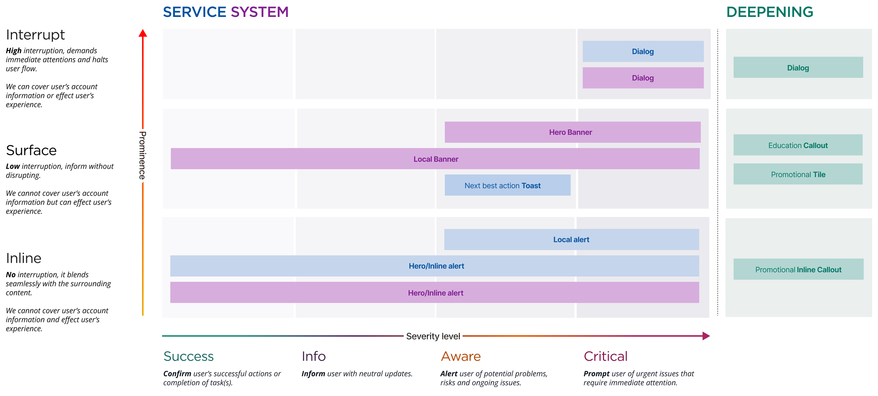
Proposal new pattern map
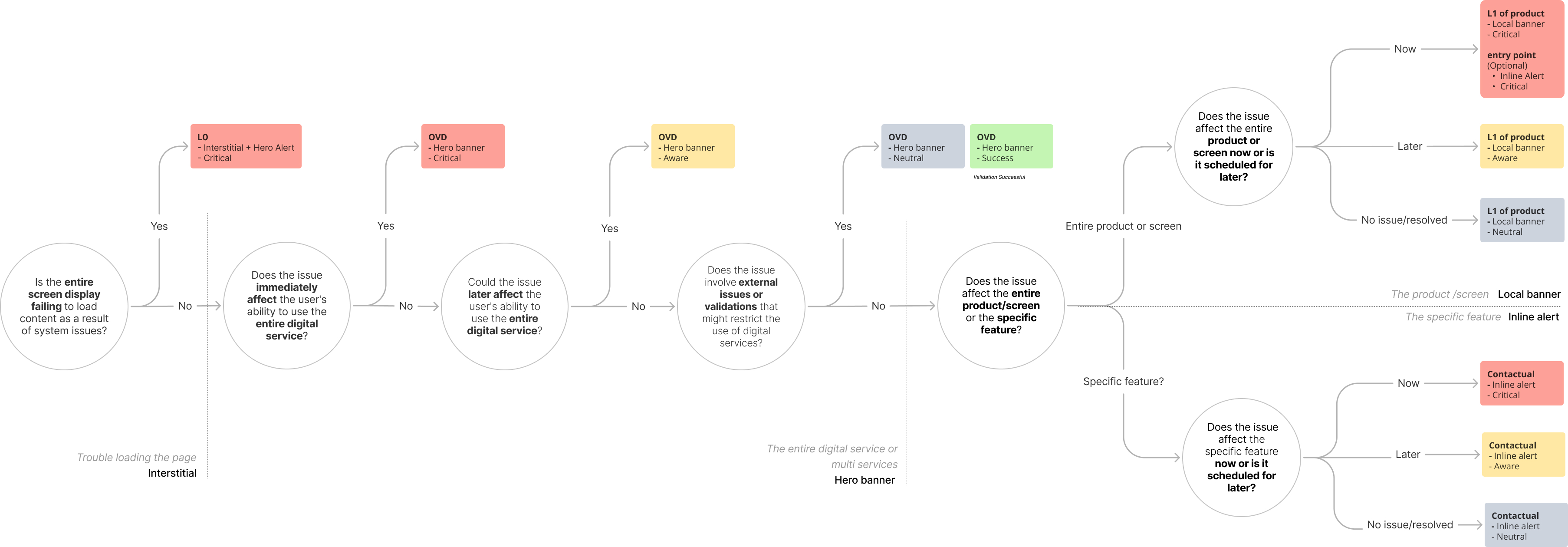
Mapping prominence level and severity level together ensures that each component serves its purpose systematically. The pattern map is designed to help teams easily identify the optimal component usage based on demand.
Design Direction
To ensure all types of messages are noticed, understood, and trusted, we established a clear design strategy and solution that strengthens visual clarity, accessibility, and hierarchy across all message types.
Design strategy
- Clearly differentiate the visual treatment of servicing messages, system messages, and deep-dive messages to prevent banner blindness.
- Establish strong visual hierarchy to help users easily recognize different levels of message severity.
- Ensure accessibility by conveying message severity in ways that remain clear for users with color blindness or other visual impairments.
Design Solution
- Assign distinct colors to each severity level to support intuitive recognition.
- Use standardized iconography to clearly communicate the urgency and intent of each message.
- Define a clear hierarchy of size, spacing, and placement to visually emphasize message severity and importance.
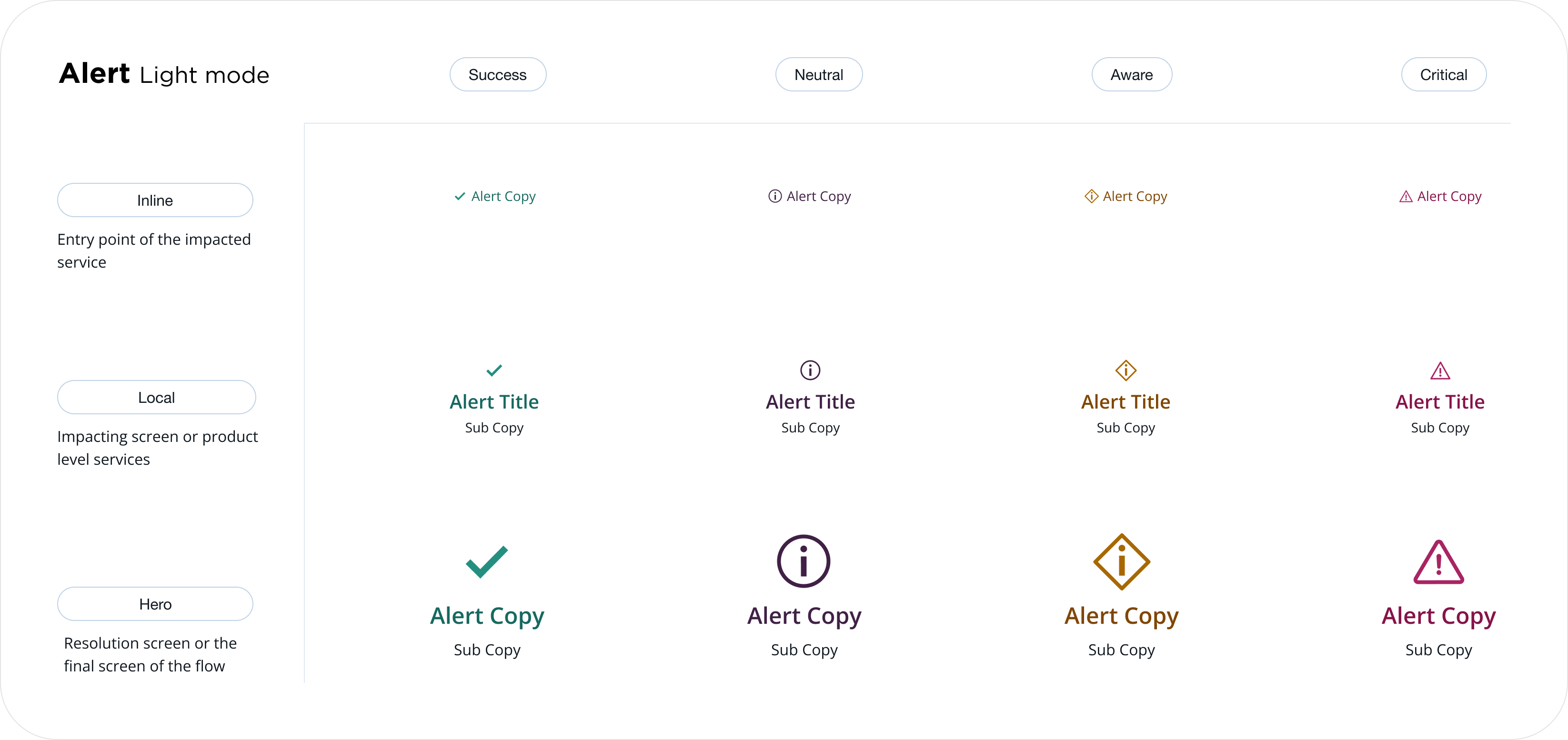
Enhanced system & pattern
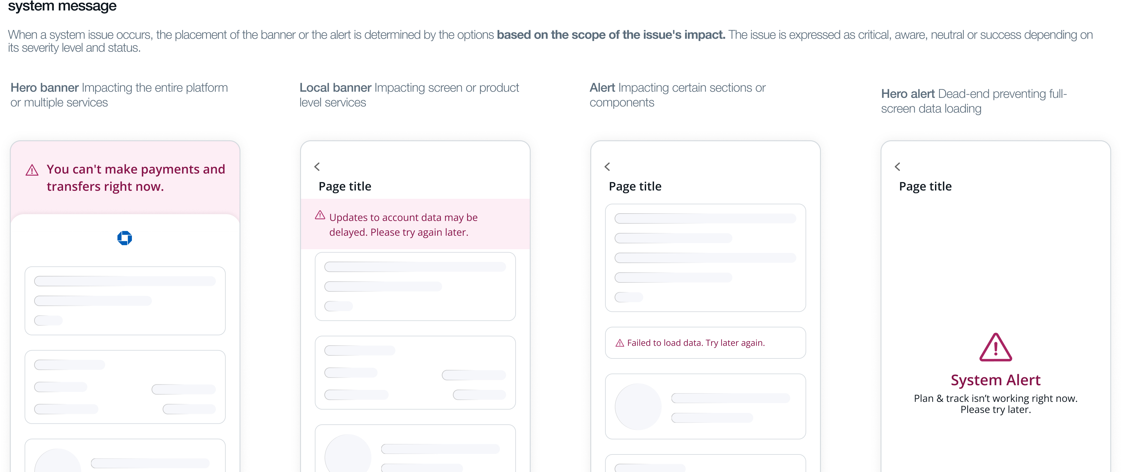
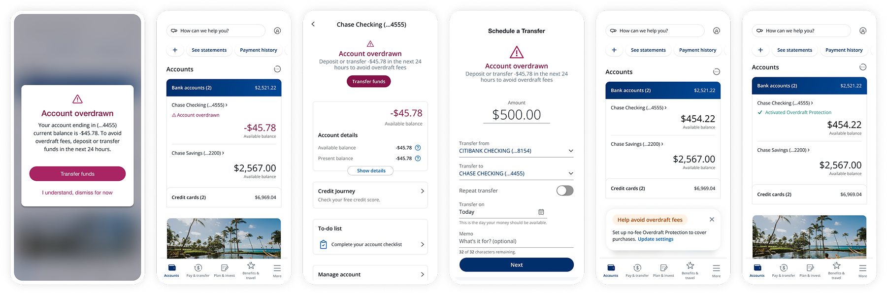
The upgraded messaging system helps customers quickly identify and resolve service or system issues while using digital banking.Placement hierarchy for messages. When service/system issues happen, the placement of the banner or the alert is determined by the options based on the scope of the issue's impact. The issue is expressed as critical, aware, neutral, or success depending on its severity level and status.
Decision tree
Final output
Simulation example on the screens
Proof of results
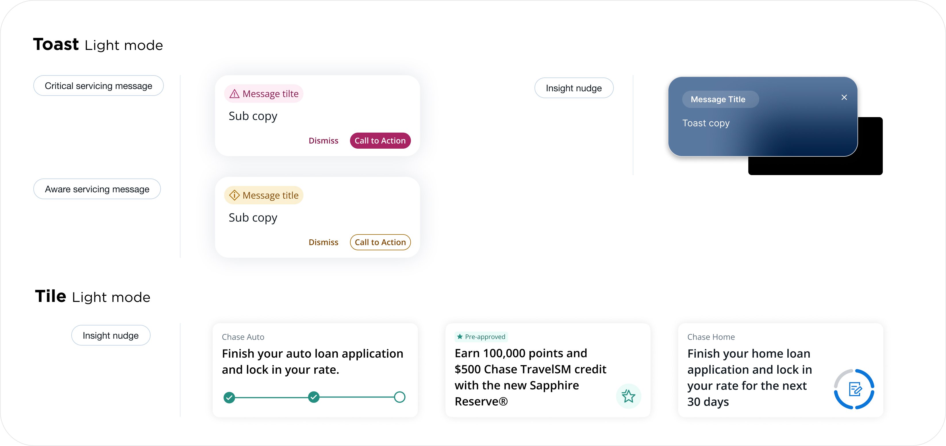
We tested it in various ways before applying the strong background. We expected that the strong color would be off-putting to users, but they liked the clear distinction between the service message and the promotional message, and it increased engagement, and they said it made them feel more trusting.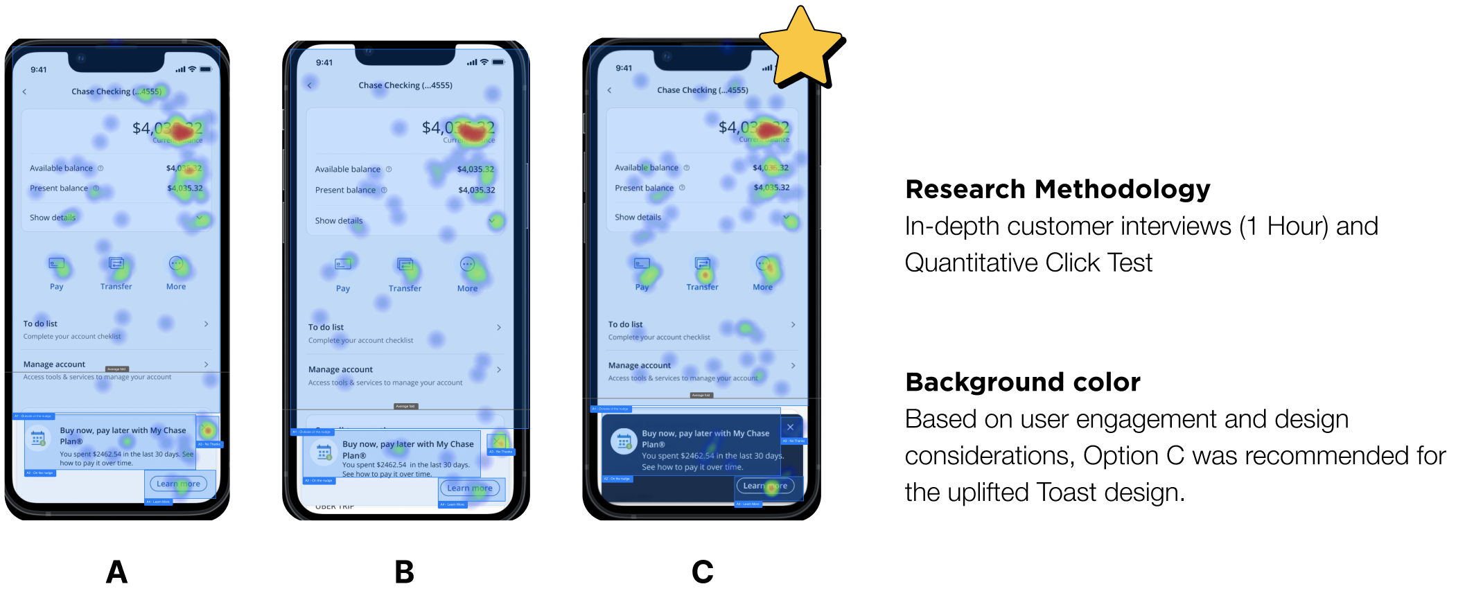
Research result
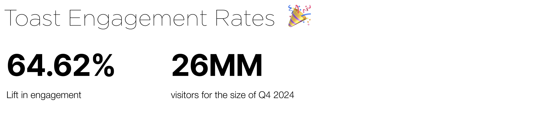
With the result from toast, I'm happy to share that the Toast uplift results in a 64.62% increase in engagement post launch. Till this day I continue to reach out to my former data partner and monitor the data dashboard, because capturing long term results is crucial for refining my designs.
Final Result
The fundamental problem of communication effectiveness. We are bridging the gap between internal design processes and external customer experiences. Chase’s messaging is not only consistent and efficient to produce but also resonates with and serves the needs of our customers.