Chase Visualization
Purpose
Users rely on financial data to make important decisions, yet complex data is often difficult to interpret quickly and confidently. Existing experiences lacked clear visual hierarchy, making it challenging for users to understand relationships between values, trends, and context at a glance.At the same time, Chase’s growing ecosystem required data-visual components that could scale seamlessly across products while maintaining consistency with the Design North Star and preserving a premium brand experience.
Solution
We redesigned the data visualization system to present financial information in a more intuitive, legible, and visually structured way.By introducing tile-based and contextual layout patterns, we established stronger visual hierarchy and improved scannability across data-dense surfaces. All components were fully tokenized to support Chase’s multi-brand color system and ensure consistency across platforms.
While the foundational elements were intentionally simplified for scalability, carefully crafted visual details were added to retain Chase’s distinct data-visual identity and elevate the overall aesthetic.
Impact
The redesigned system significantly improved clarity and usability, enabling users to understand key financial insights more quickly and with greater confidence.The tokenized framework now supports flexible application across multiple products and brand color themes, reducing design and engineering overhead while improving consistency.
Most importantly, the enhanced data visualization experience reinforces Chase’s premium brand perception—delivering financial information that feels not only accurate, but clear, intuitive, and trustworthy.
Design principles
1. Emphasize customer data
Prioritize key customer data by increasing visual prominence, enabling users to quickly scan, recognize, and understand the most important information at a glance.
2. Modernize visual assets
Simplify containers and remove unnecessary decorative elements. Introduce modern design treatments such as gradients and refined border radii to create a cleaner, more contemporary experience.
3. Improve legibility
Enhance readability through intentional use of white space, strengthening visual hierarchy while reducing cognitive load, visual noise, and data overload.
4. Design for scalability across layouts
Enable flexible adoption across products by offering a range of layout variants that support our partners’ diverse use cases and platform requirements.
Introducing Glanceable Data
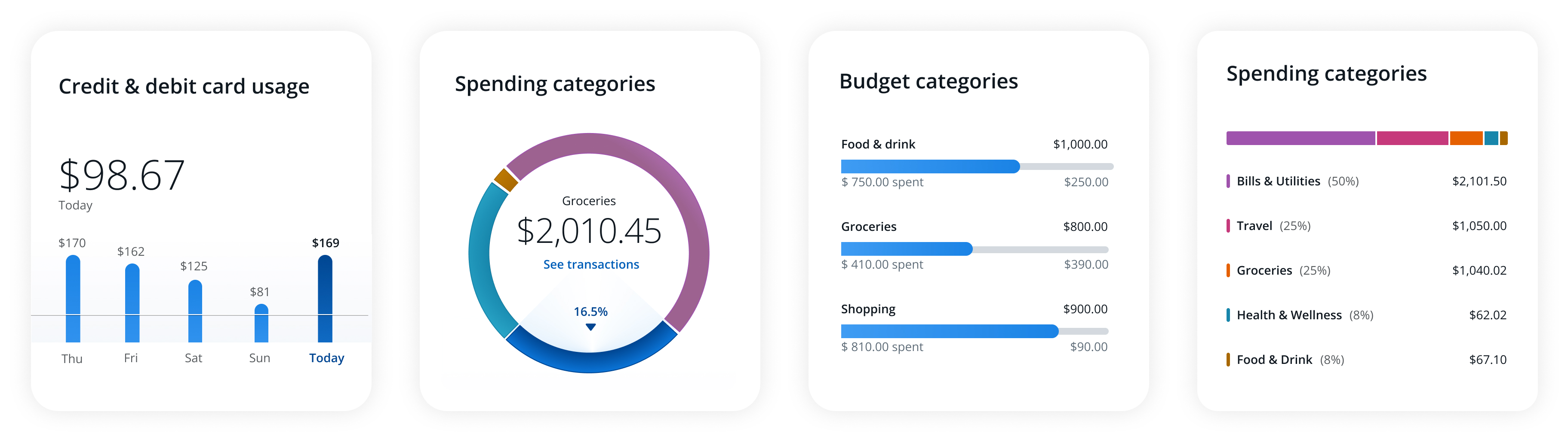
Most customers interact with digital experiences at a surface level—occasionally seeking additional context, but rarely exploring deeply. To support this behavior, data skim charts present information that is easy to scan at a glance while still communicating what matters most. They prioritize clarity, relevance, and hierarchy to help users understand key information quickly and confidently.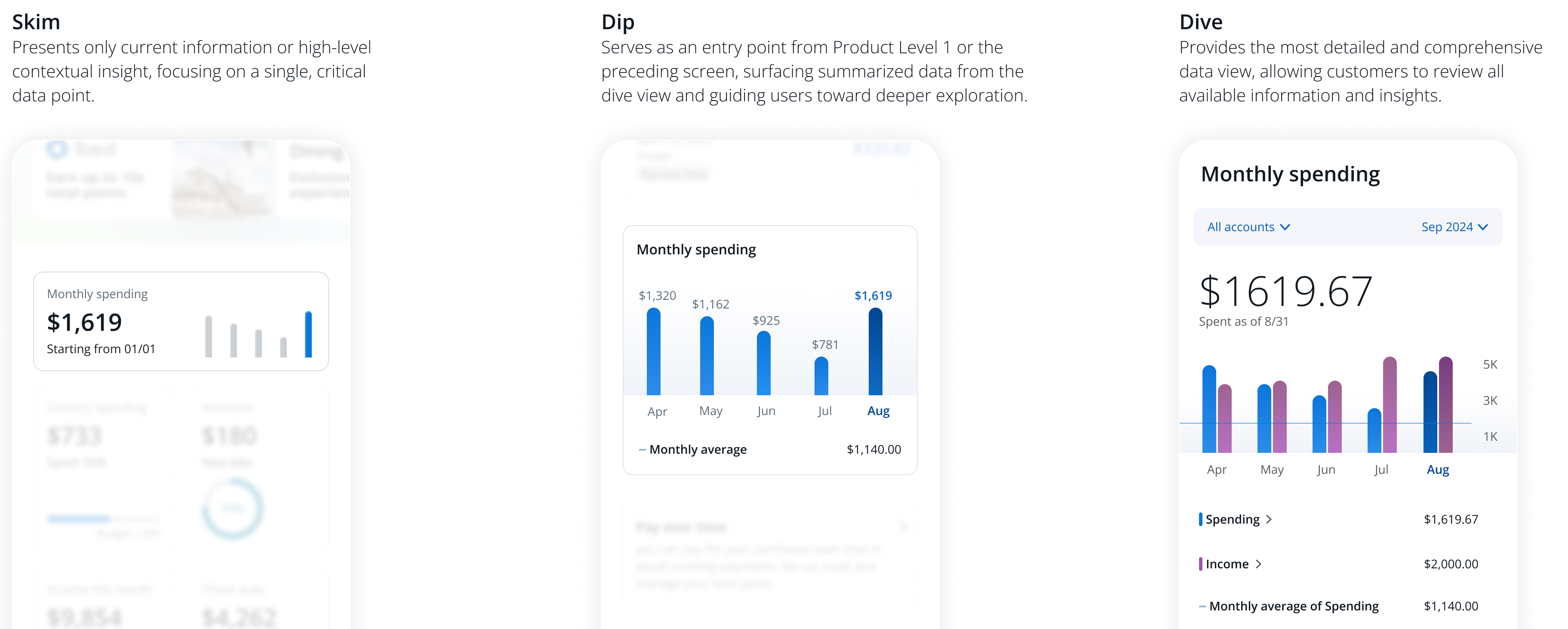
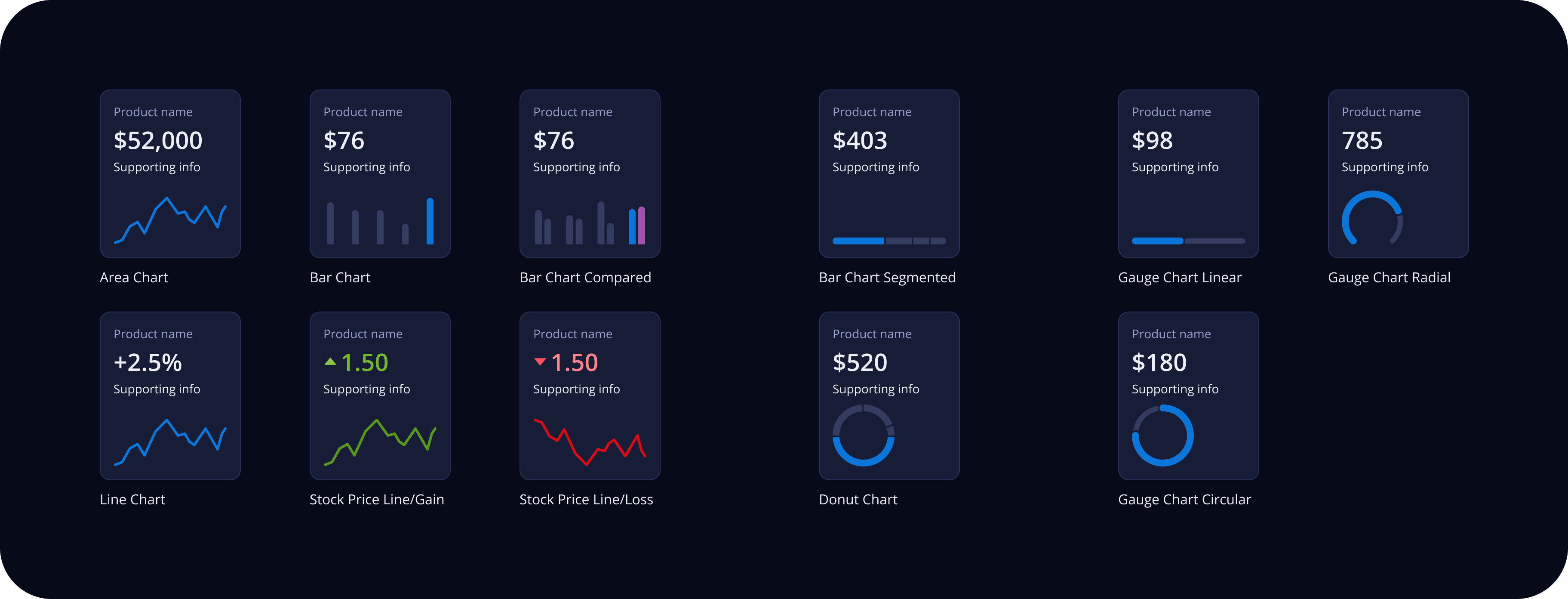
Skim Data-Viz charts
A skim chart tile is a compact asset that communicates high-level relevance by highlighting crucial data with simplified visual charts. It provides users with essential information at a glance and acts as an entry point for delving into more detailed insights.Micro interaction
Introduces micro-interactions that enhance loading states and enable users to experience data dynamically within charts, improving clarity and perceived responsiveness.Light & Dark mode
Supports both light and dark color modes with carefully defined color tokens, ensuring accessibility standards are met through appropriate contrast ratios.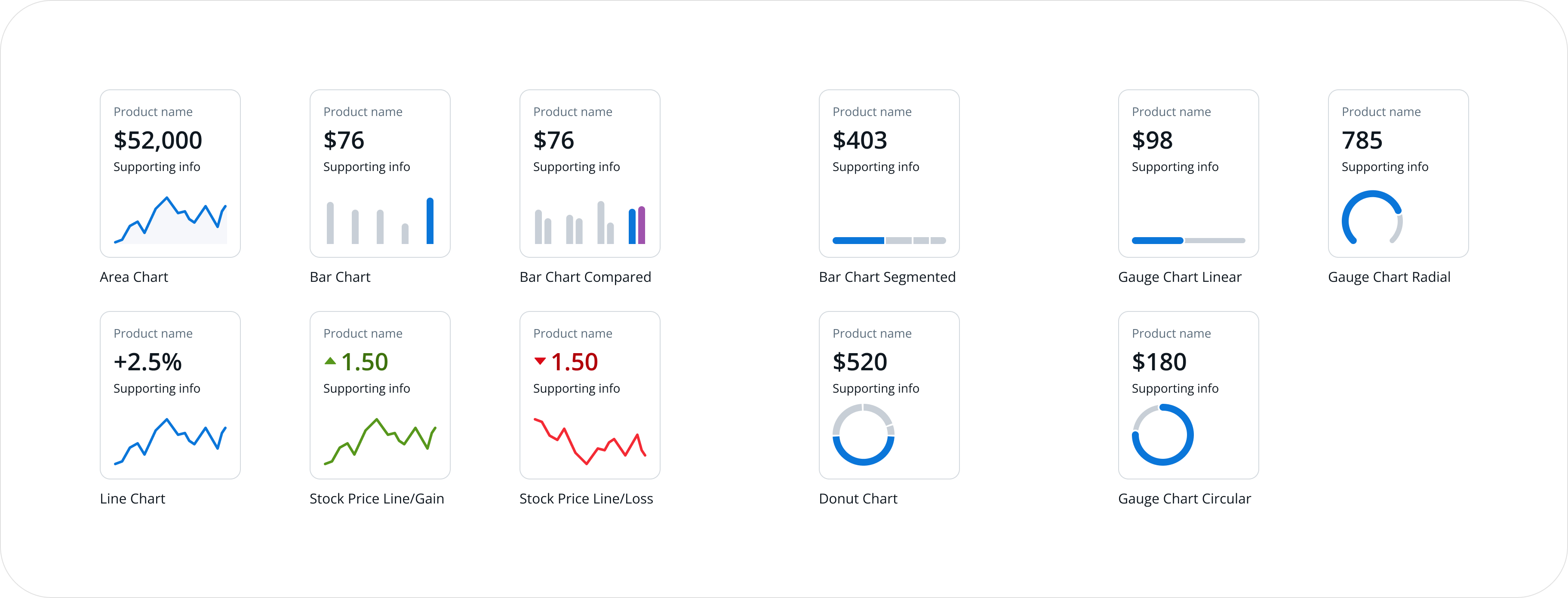
Dynamic layout Option
Provides flexible layout options that include only essential elements, enabling users to quickly scan and clearly understand information even within limited space.Composition Guidelines
When utilizing multiple skim tiles, consider overall product context and see the following guide on how to combine them in a section.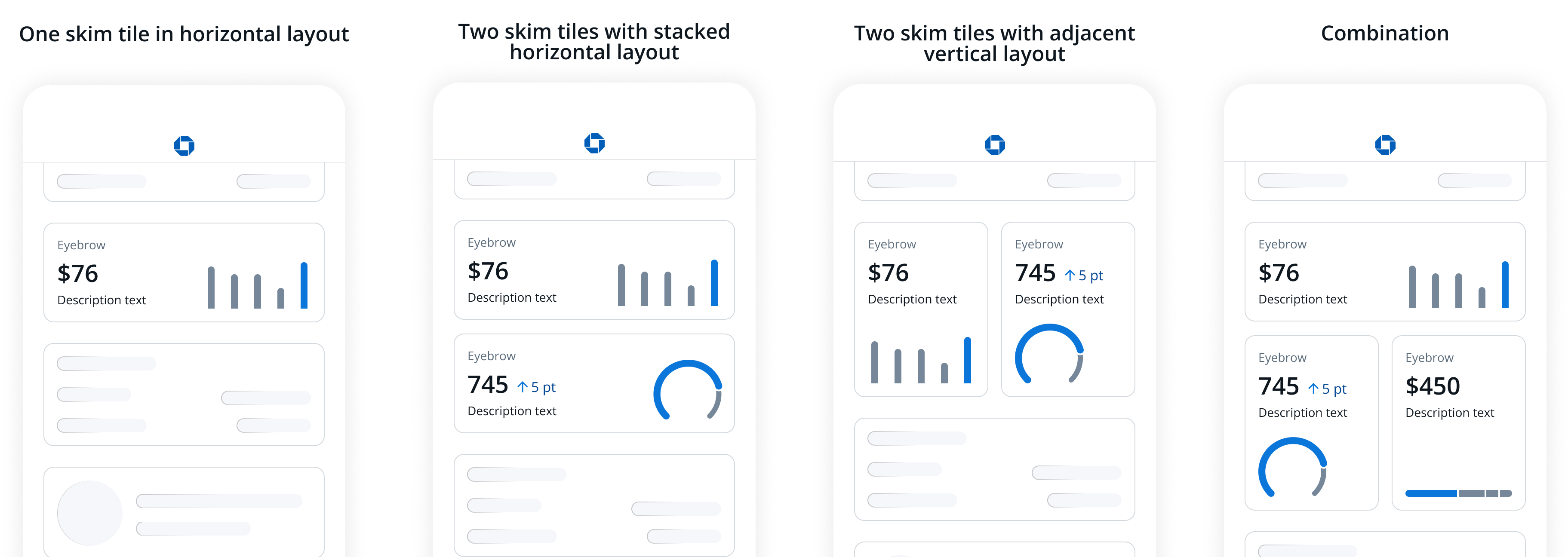
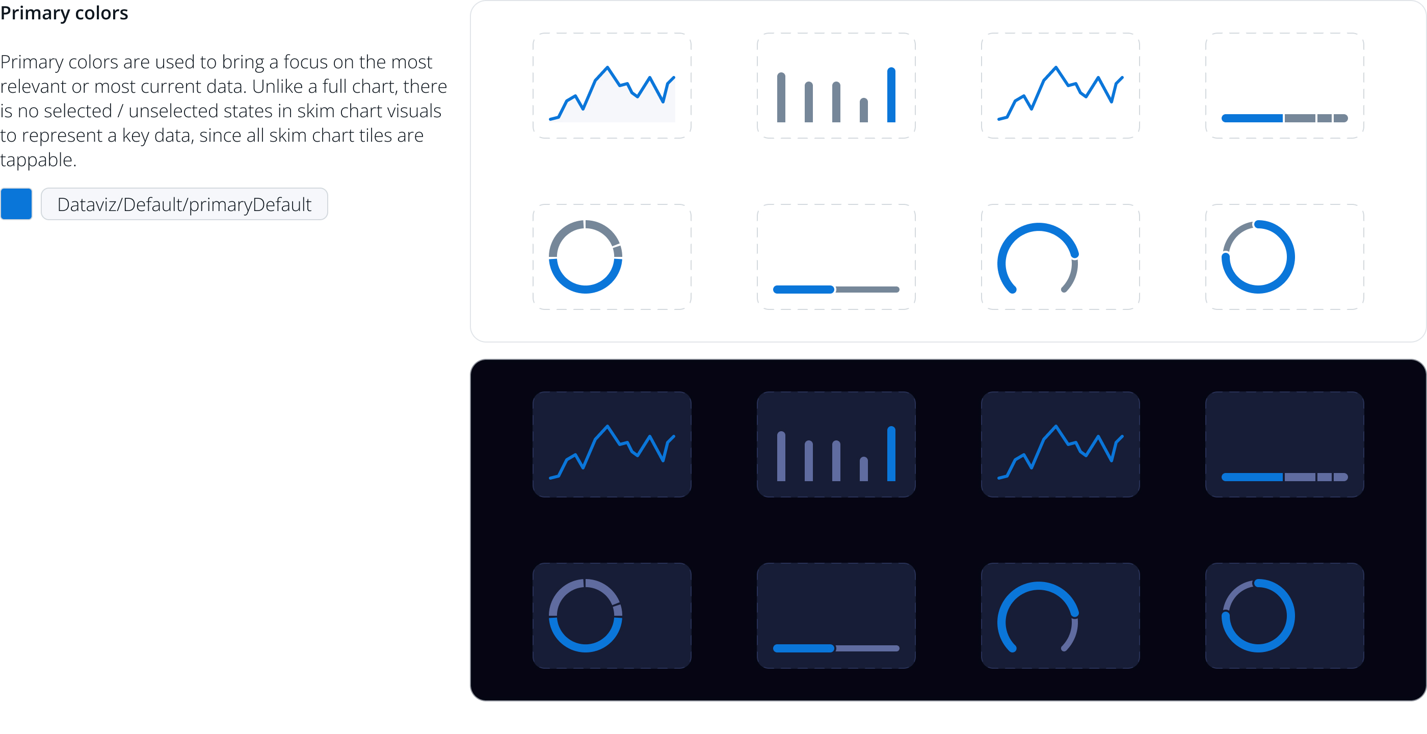
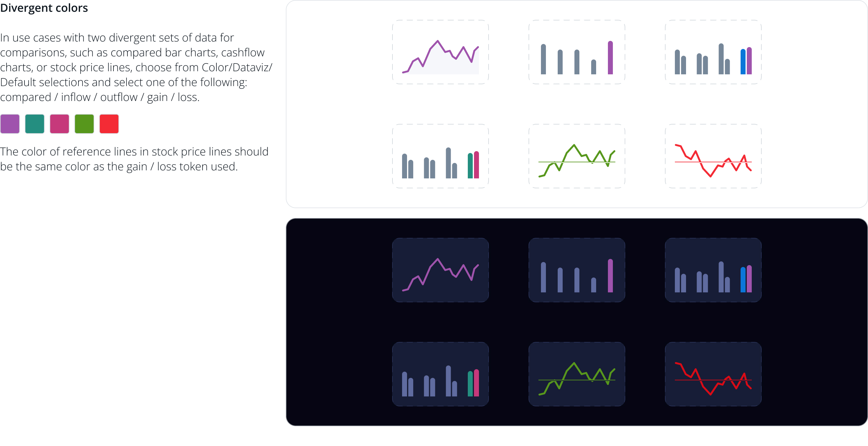
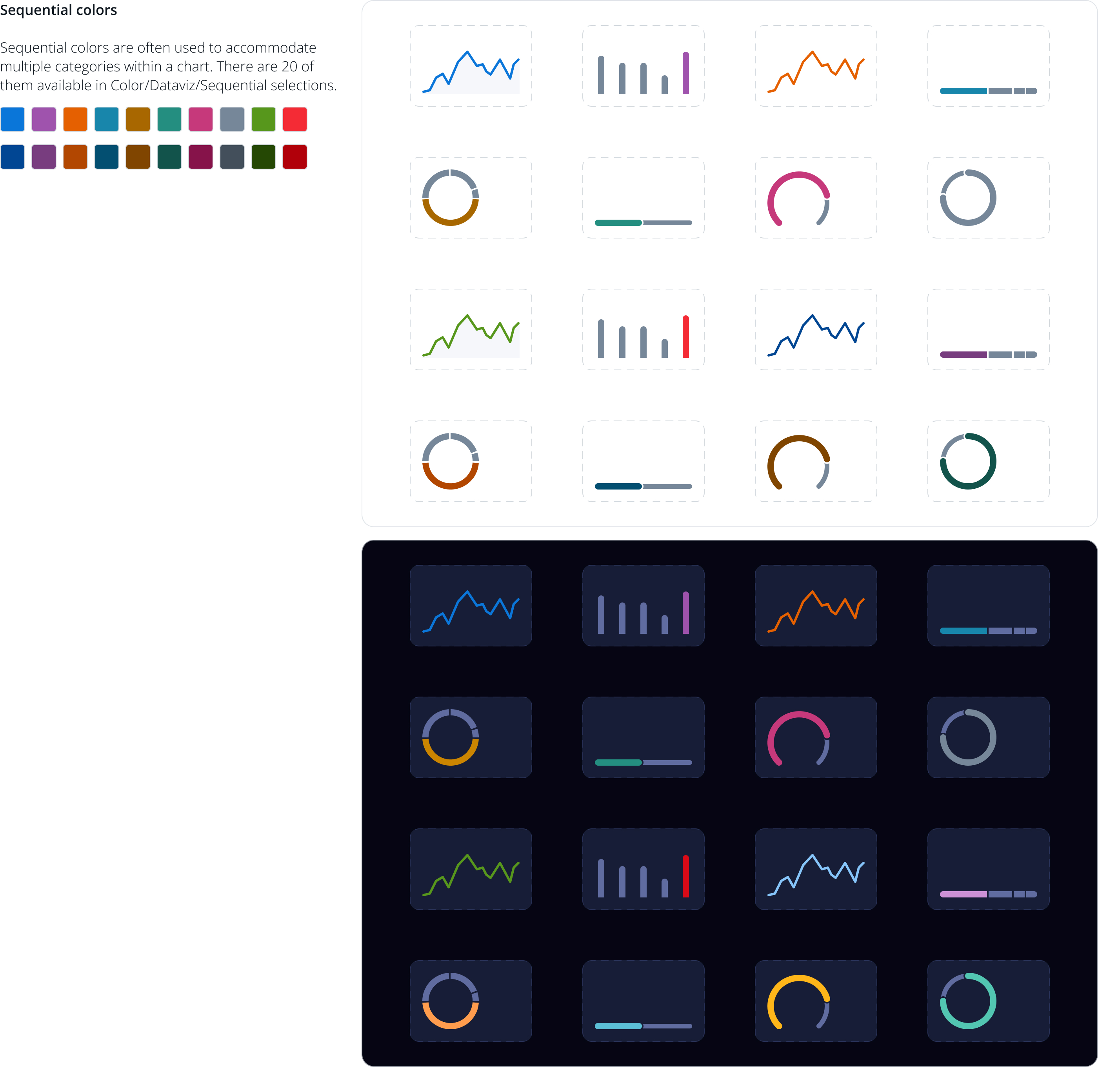
Colors
Color usage in skim charts is established from on MDS semantic color tokens - Colors/Dataviz - to reflect the most crucial number from the full chart experience.